TuringShot 1.5.7 UI Refresh — Guide, Onboarding, About Redesigned
A calmer Settings window with bigger type, refined cards, and right-aligned shortcut pills
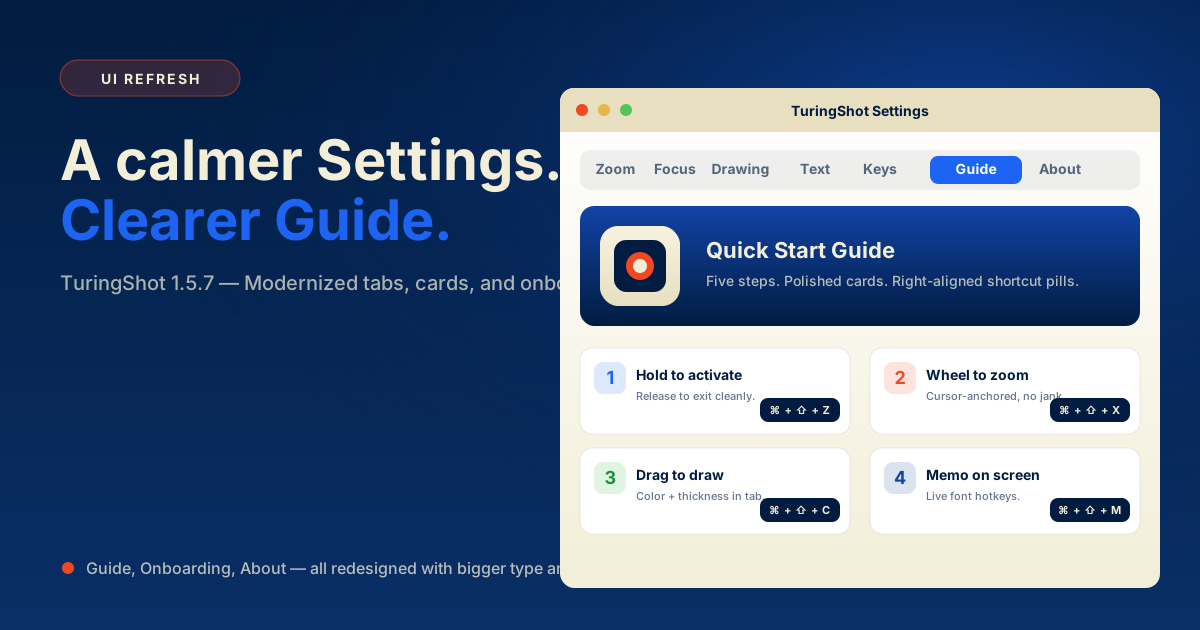
Most of 1.5.7's surface area is invisible from the outside — but if you open Settings, you'll feel it immediately. The Guide tab, onboarding popup, and About tab were rebuilt with bigger type, refined cards, and shortcut pills that actually align where you expect.
Guide tab: a confident hero, calmer cards
The Guide tab now opens with a dark hero card showing the TuringShot icon on a cream pad — the same icon you see on your dock and Mac App Store listing. The hero used to be a generic bolt symbol; replacing it with the actual app icon gives the tab a stronger sense of place.
Below the hero, the five quick-start cards were re-spaced. Title size moved from 15pt to 16pt, descriptions from 13pt to 14pt, and the icon badges grew from 26px to 32px. Each card has a slightly stronger border and a softer shadow, so they read as discrete units rather than blending into the background.
Padding and breathing room
Card corner radius grew from 10 to 12. Internal stack spacing increased so titles and descriptions don't crowd each other.
Bigger, more legible
Tab labels moved to 14pt semibold. Section labels use refined kerning with horizontal divider lines on each side.
Right-aligned, consistent
Shortcut pills now have a minimum width of 138px and 32px height. They always sit on the right edge of each card, not floating somewhere mid-row.
App icon, not a glyph
The Guide hero swapped the SF Symbol bolt for the actual AppIcon.icns rendered on a cream pad — the icon you already recognize.
Onboarding popup: matching the Guide tab
The first-launch Quick Start popup mirrors the Guide tab now. The same 32px circle badges, 16pt titles, 14pt descriptions, and 138px shortcut pills. The two surfaces are intentionally consistent — if a returning user re-opens the onboarding, the muscle memory carries over.
Per-row width pinning fixed a subtle alignment bug too. Previously the rows could drift a few pixels depending on which shortcut was longest. Now every row spans the full width of the popup, and the pill always lands at the right edge.
About tab: the icon now stands out
The About tab's hero used to be a dark icon on a dark gradient — the silhouette blended into the background. The fix was a cream-colored 104×104 pad (#F7F2E0) behind a 24-radius rounded icon, with a deeper shadow to anchor it. Now the TuringShot icon reads cleanly even on dark mode systems.
The smaller text got attention too. The FREE / PREMIUM badges moved from 10pt to 12pt with extra padding. The Terms / Privacy link button went from 12pt to 13pt. The premium headline, status, and restore button all got a 1pt bump so the lower portion of the tab no longer feels like microcopy.
Smaller refinements you'll notice
- The redundant "권한 상태" badge above the permission card title was removed — the title itself already labels the section.
- Section labels now have horizontal divider lines on each side, like a printed table of contents.
- The copyright label and policy caption font sizes were bumped by 1pt each so the footer of the About tab no longer requires squinting.
Why this matters for screen recording
TuringShot is used during screen recordings and presentations. If you have to open Settings mid-record to flip a toggle, the audience sees that window. A calmer, more confident Settings window is part of the recording experience — it reads as a tool that belongs on screen, not something you scramble to close.
That's why this refresh focused on typography and alignment rather than new color palettes or animation. Calmer surfaces, consistent shortcut pills, and recognizable app branding — that's enough to make Settings look intentional on a recording.
Frequently asked questions
Why redesign the Guide tab now?
TuringShot is used during recordings; the Settings window can briefly appear on viewers' screens, so it needed to feel intentional and polished.
Did any features change in 1.5.7 UI Refresh?
No new features in this refresh — only typography, spacing, and visual consistency.
Why bigger fonts?
13pt and smaller were hard to read at presentation distances; the 14pt baseline matches macOS HIG recommendations for Settings panes.
Does this affect the App Store version?
Yes — version 1.5.7 (Build 39) ships the UI refresh.
TuringShot v1.5.7
Free screen zoom. Premium tools include focus, lens, drawing, Text On Screen, Pointer Trail, and Key Display.
Download on Mac App Store